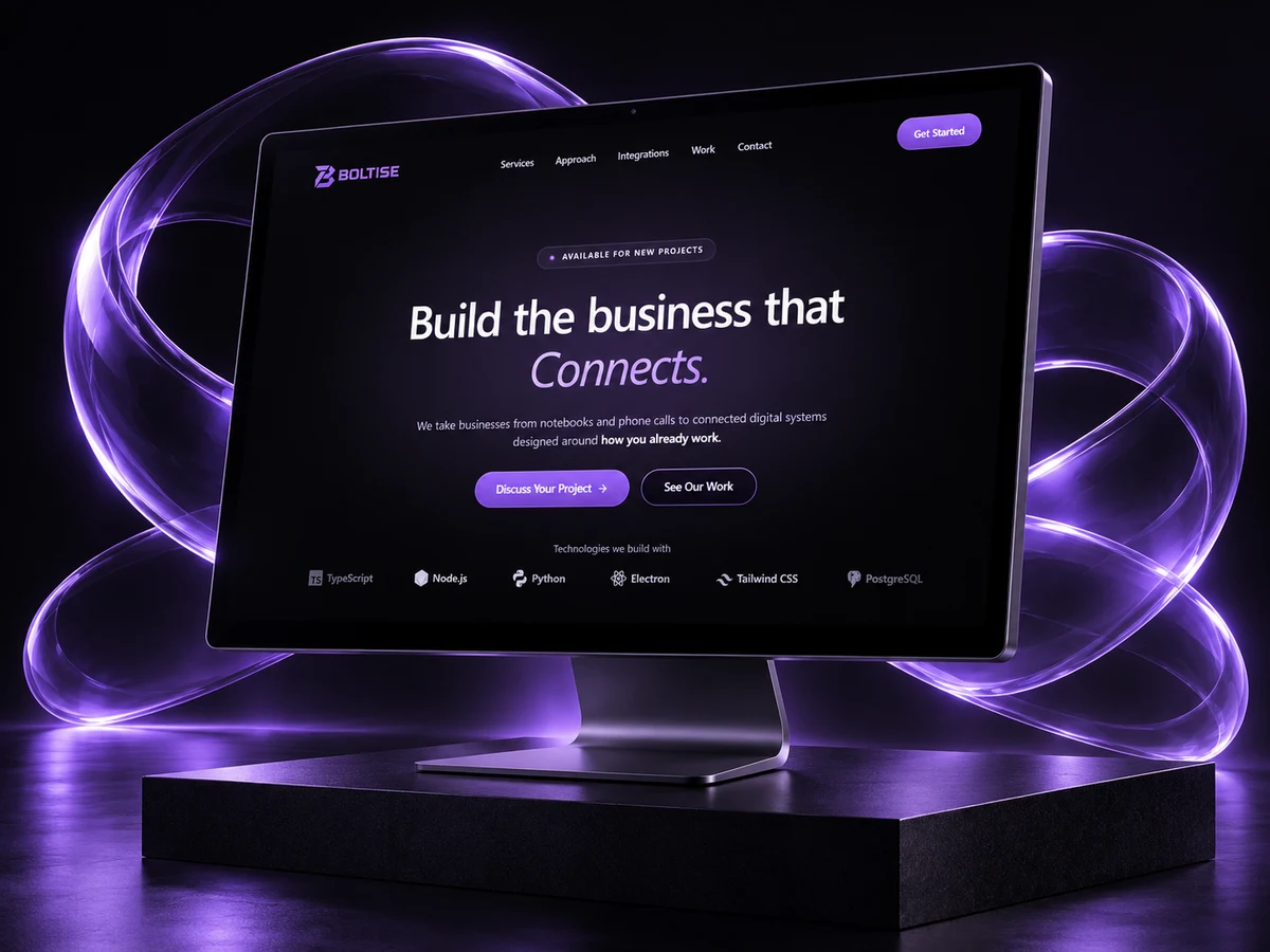
Main design & development; team completed launch and later updates
Date
July–August 2026
Deliverable
Landing page & animated service illustrations
Explain the offer before asking for an enquiry.
Boltise offers AI engineering, automation, SaaS, web applications, cloud infrastructure and WhatsApp Business systems. The redesign needed to connect that technical range to recognizable business needs, while staying close to the previous website’s visual direction.
The design challenge
Who it is for
Business owners exploring software, automation and connected systems.
The central task
Understand the offer, find a relevant capability and start an enquiry.
The design tension
Retain the client’s preferred black-and-purple technology aesthetic and continuity with the previous site, while making the offer clearer.
A route from proposition to conversation.
The landing page supports both a ready-to-enquire visitor and someone still evaluating the company.
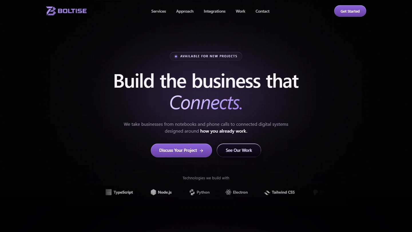
Understand — The opening explains the business proposition and offers two entry routes.
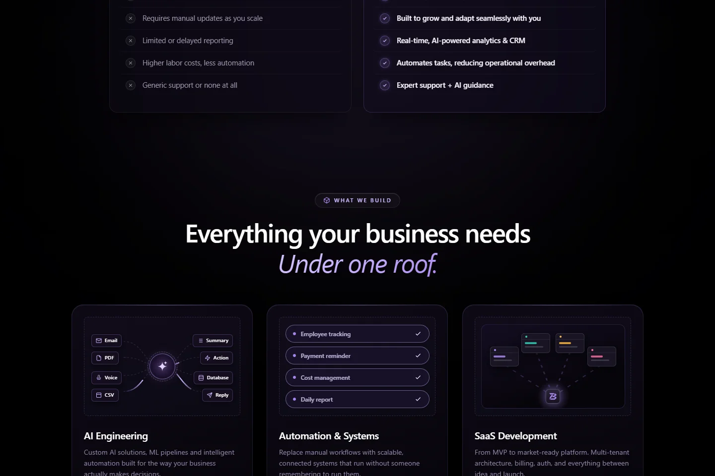
Compare — Repeated service cards pair capabilities with concrete diagrams.
Evaluate — The approach and selected work provide more context for the partnership.
Enquire — Project discussion and contact routes turn interest into a conversation.
Information hierarchy of the delivered landing page.
Design decisions
Give visitors two ways to begin.
The opening puts the business proposition before the detailed service list. “Discuss Your Project” serves someone ready to enquire; “See Our Work” gives a visitor who is still evaluating the company a lower-commitment route.
The opening pairs a central proposition with enquiry and work actions.
Make the services easier to compare.
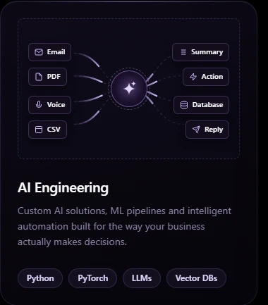
Each service card leads with a diagram and a short benefit statement, then provides technology tags for readers who want implementation details. The repeated structure makes the range easier to scan without making the technology stack the first message.
Repeated card anatomy connects service names with examples of the systems being offered.
Carry the visual direction into the working page.
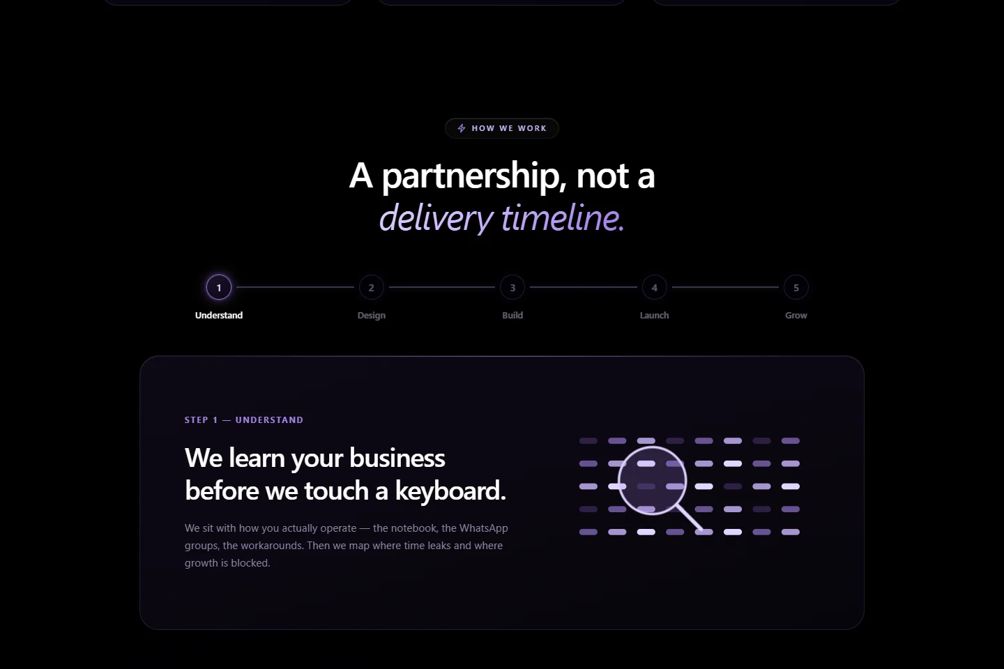
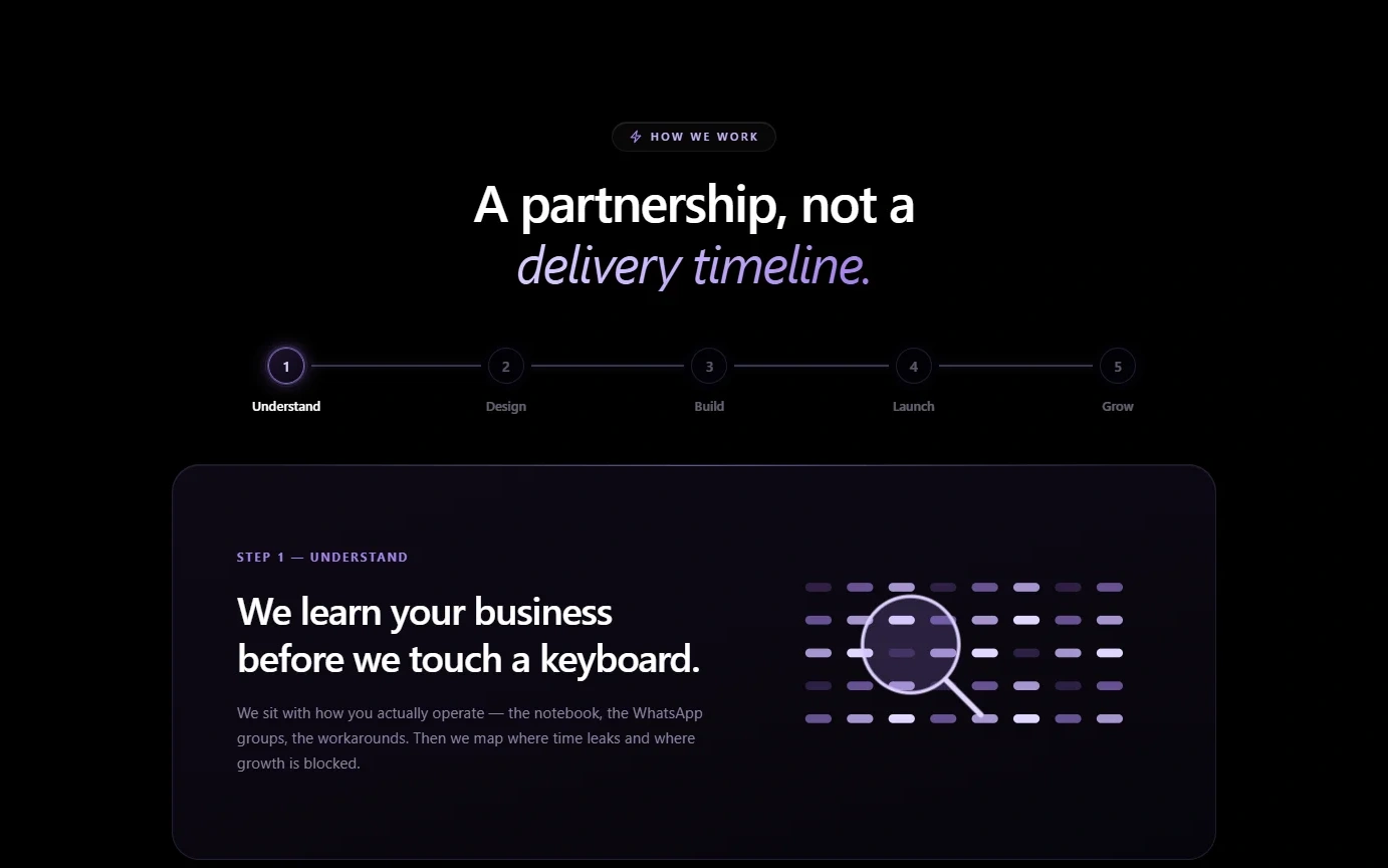
I carried the design into HTML, CSS and JavaScript, including service-card interactions and the five-stage partnership sequence. The implementation also includes mobile navigation and searchable, filterable FAQs, extending the work beyond static layouts.
The company’s five-stage partnership sequence explains what working together involves.
A repeatable system for technical storytelling.
The client wanted to retain the black-and-purple technology direction of the previous website. Within that boundary, light typography, repeated card anatomy and consistent diagram treatments give the services a shared visual language.
Plus Jakarta Sans
The same type family handles the central proposition, service names, supporting copy and diagram labels.
Colour roles: Night, Violet, Pale violet, Paper.
Components in context
Service-card anatomy
Diagram, service name, benefit and technology tags repeat across capabilities.
Action hierarchy
The opening distinguishes discussing a project from exploring the work.
Partnership sequence
A repeated visual sequence connects Understand, Design, Build, Launch and Grow.
The working page carries the same card structure and diagram language across its service areas.
A company website, designed and built.
I designed and developed the main landing page, its service illustrations and partnership animation during my internship. The team completed the launch after my internship ended and has since updated the site. My case study focuses on the design and implementation I worked on.
What I learned
I learned to adapt my design decisions to a client’s priorities, even when their preferred style differed from my own. The black-and-purple direction was a firm requirement and the previous site used a similar aesthetic, so a drastic visual departure was not an option. I focused on improving hierarchy, service explanations and interactions within that direction.