Make the conversation easier to begin.
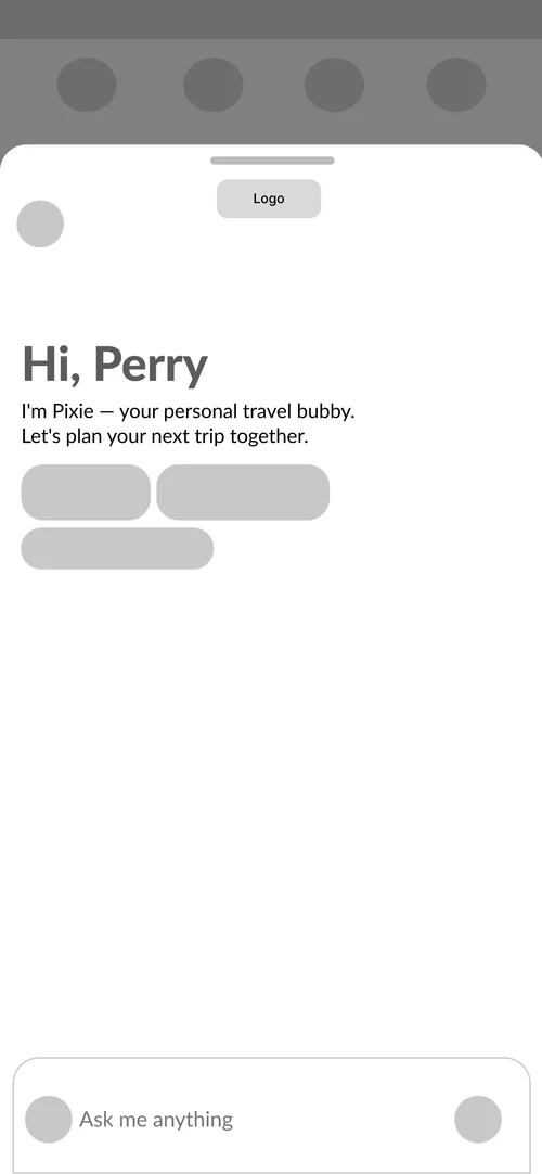
Suggested prompts introduce the assistant’s scope before someone types. The companion opens as a sheet over the booking app, preserving context while keeping the input available as the conversation grows.
Group app concept
A team concept for a conversational travel companion inside Ixigo. My primary contribution was UI design.
Explore the interactive case study ↗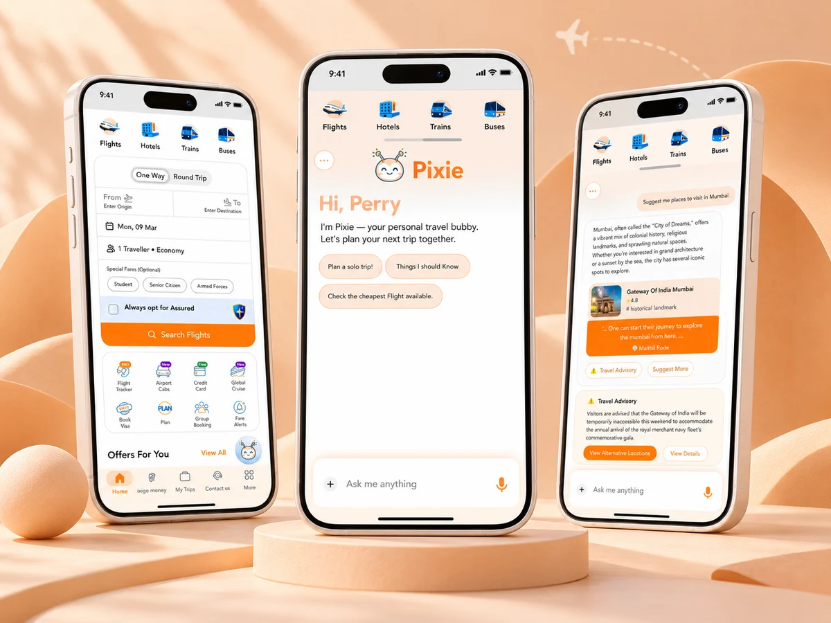
The team explored the information travelers search for before and during a trip, from baggage rules to disruptions. Pixie proposes an assistant layer within the booking app, bringing guidance and possible next actions into the same conversation.
The assistant is designed as a sheet within Ixigo, with booking categories still visible behind it.
Conversation structure shown in the screen set.
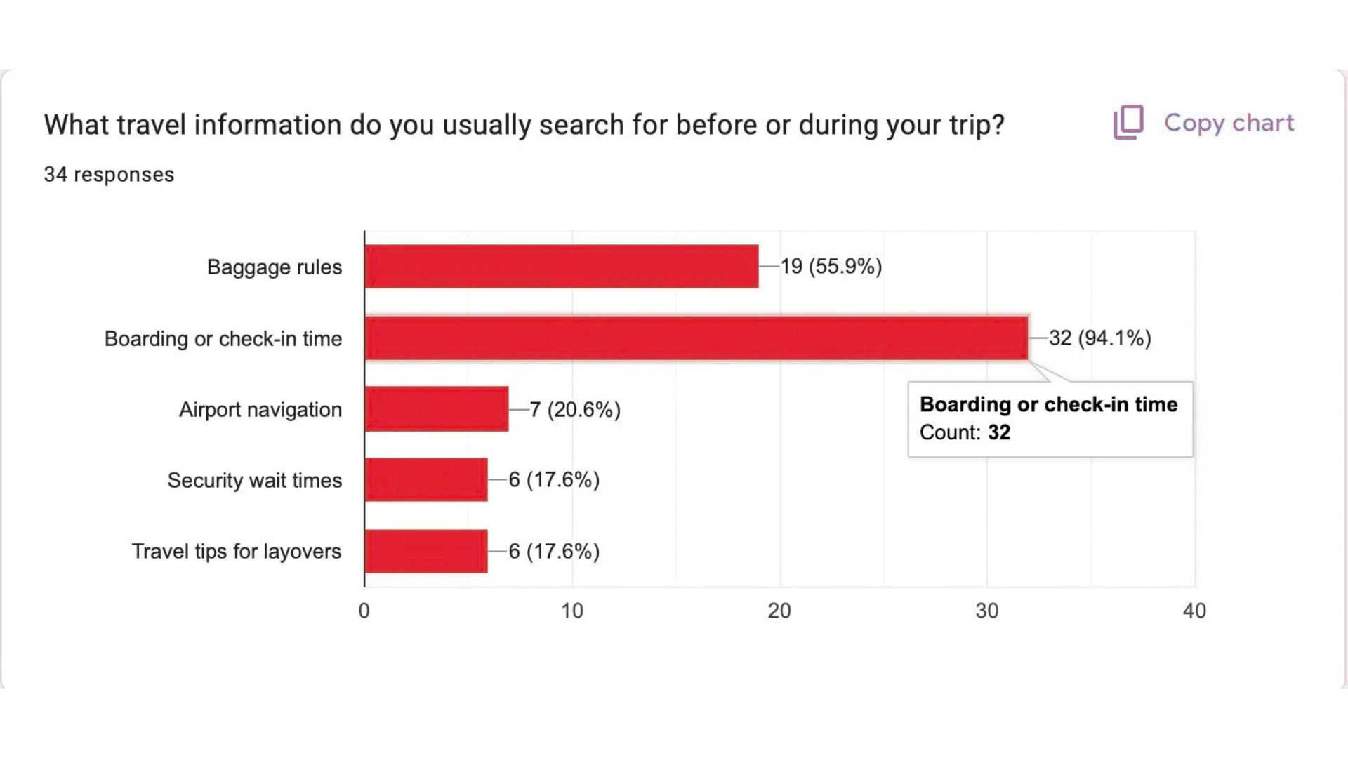
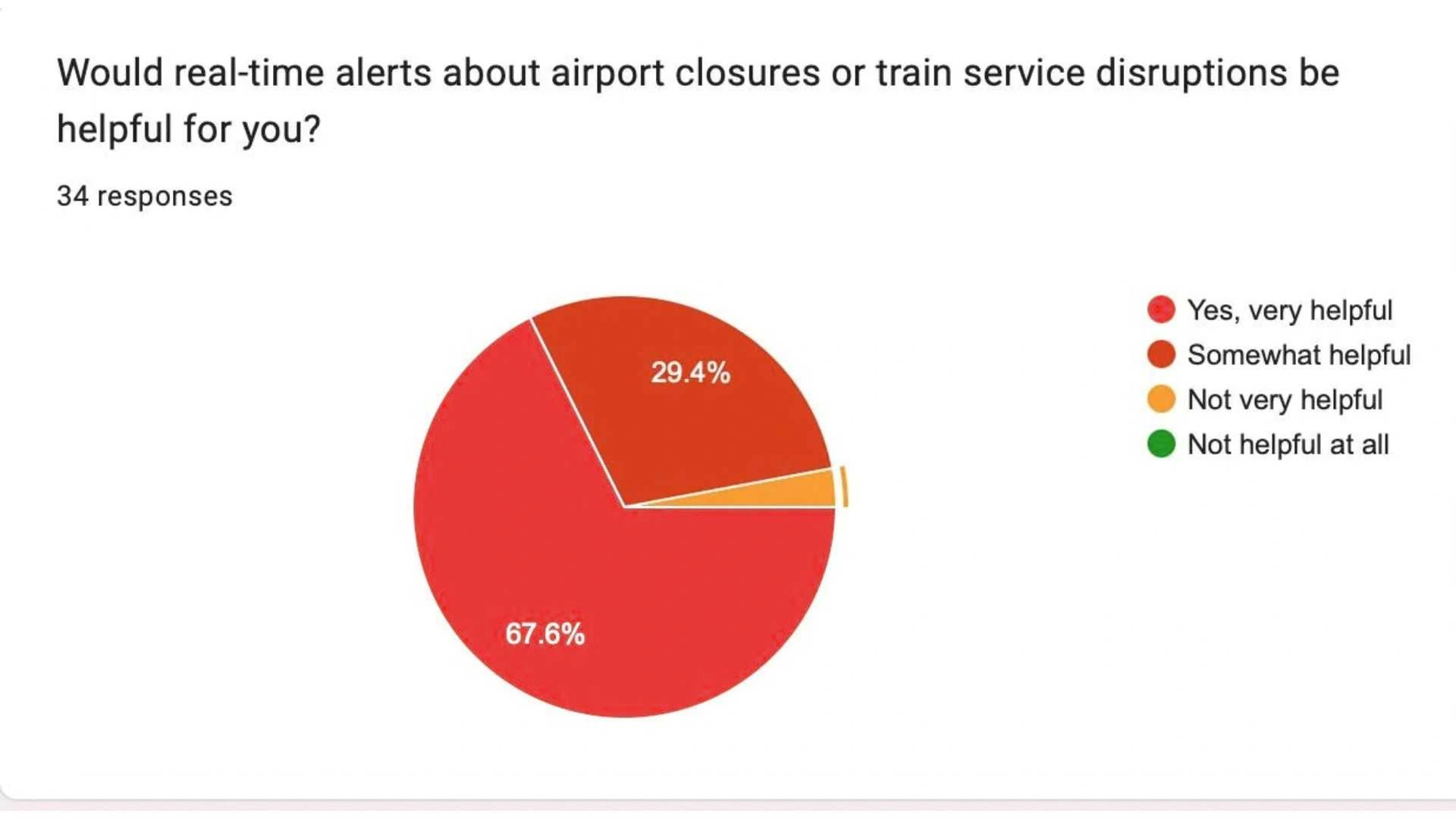
The team’s questionnaire explored practical travel-information needs. Boarding times and disruption alerts were the strongest signals in the retained charts.
34 responses · multiple selections
The strongest signal was a practical, time-sensitive trip question.
View original chart34 responses
Alerts deserve a clear place in the conversation and a useful next action.
View original chart34 responses
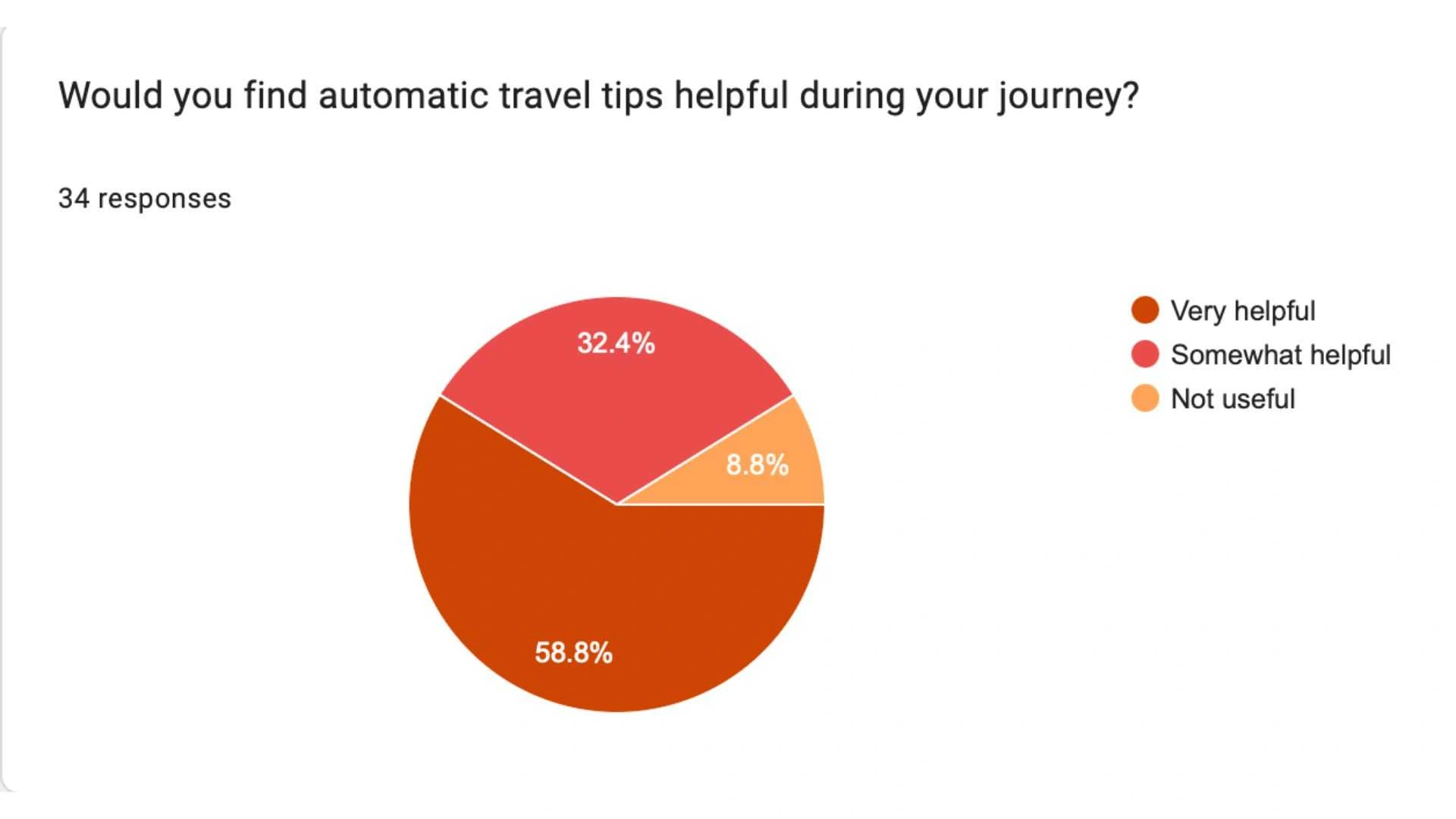
Tips were of interest, with room to control their relevance and frequency.
View original chartOriginal team questionnaire: 34 responses to each charted question. Information search allowed multiple selections. These are stated preferences, not usability results. Interview sample and recruitment details were not retained.
Redrawn from the original exports. Bars share a 0–100% scale. Published percentages retain their original rounding.
Suggested prompts introduce the assistant’s scope before someone types. The companion opens as a sheet over the booking app, preserving context while keeping the input available as the conversation grows.
Destination cards make a recommendation scannable; a separate advisory panel gives a possible disruption its own hierarchy and actions. This scenario explores destination discovery; flight-specific questions would need verified airline information.
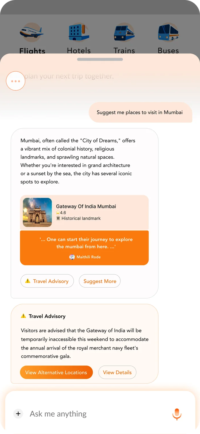
Apricot, orange and the illustrated companion establish Pixie’s presence. Neutral message surfaces keep the conversation readable without replacing the parent app’s navigation.
A welcoming display line introduces the companion; compact body text carries messages, prompts and actions.
Colour roles: Apricot, Orange, Paper, Ink.

Short questions show possible starting points without requiring the traveler to compose a first message.
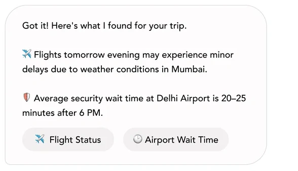
The example answer groups guidance with flight-status and airport-wait-time actions.

The message field stays at the bottom of the companion sheet.
The examples reproduce the original interface. Travel messages are illustrative prototype content.
Quick actions make the reply more useful, but the interface also raises questions about airline data and how current an answer is. The concept demonstrates the conversation design; reliable live guidance would require verified travel information.
The team concept covers welcome, conversation, recommendations, advisories, history and place details. My primary contribution was translating the shared concept into the interface: a recognizable companion, suggested starting points and a conversation sheet that keeps the booking context in view.
The most important next question is trust: what source, timing and uncertainty information does a traveler need before acting on a reply? That needs evaluation alongside the clarity of the suggested actions.