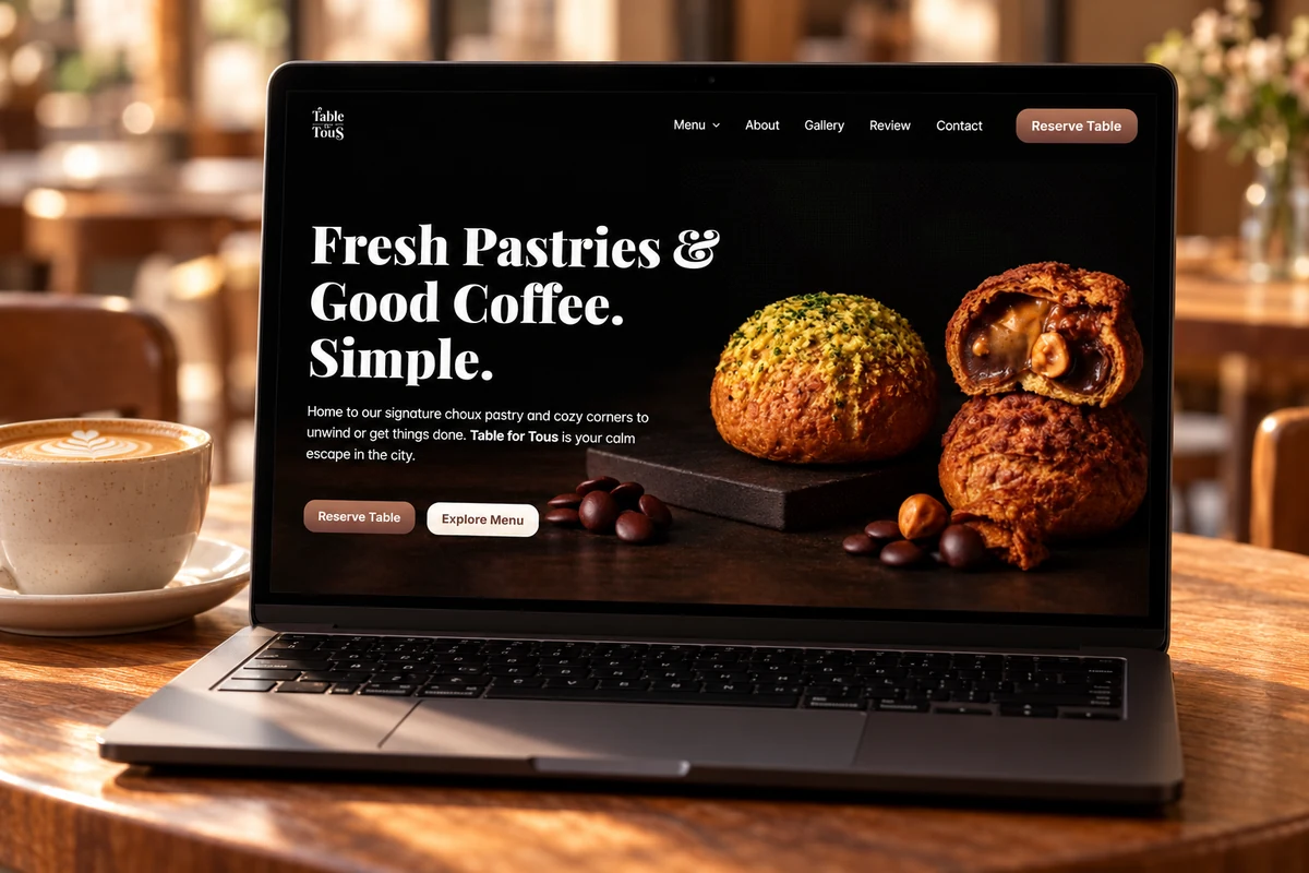
Table for Tous had a mobile menu gateway but no desktop version. I independently explored how food, interiors, typography and illustration could introduce the café on desktop. This was not commissioned by the café.
The design challenge
Who it is for
People discovering the café and looking for menu or visit information.
The central task
Explore how the café’s character could translate into a desktop introduction.
The design tension
Create atmosphere while keeping the menu intention clear; these are alternative layout studies, rather than a finished ordering service.
Two ways into the same café.
The studies explore how an opening, a café introduction and visit intentions could work together on desktop.
Arrive — Photography and a prominent headline establish the first impression.
Discover — Illustrations, interiors and food introduce the café’s character.
Choose — Dine-in, delivery and takeaway organize different visit intentions.
Continue — Menu and reservation concepts make a possible next step visible.
Proposed content hierarchy across the desktop studies.
Design decisions
Let the food establish the first impression.
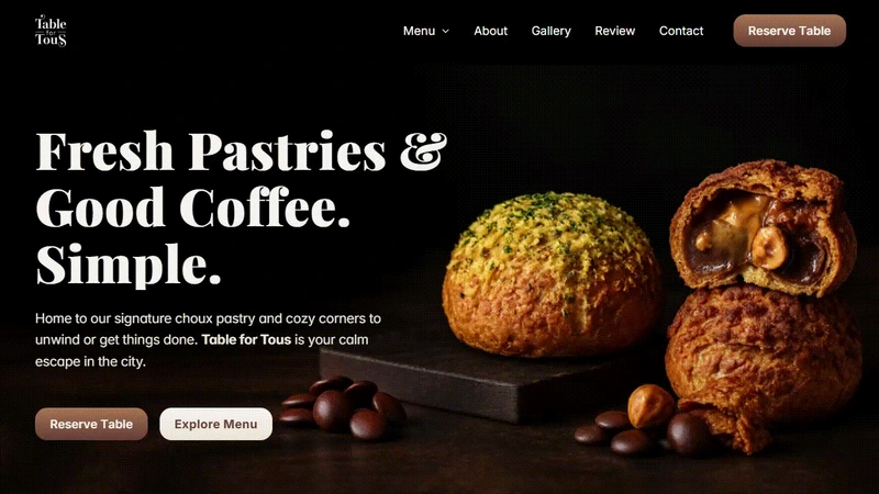
The photographic opening puts pastries and coffee at the centre of the page. Menu and reservation concepts sit alongside the introduction so the visual story has an action, rather than ending at atmosphere.
Dark hero exploration. The menu and reservation actions are illustrative.
Give the café a consistent visual voice.
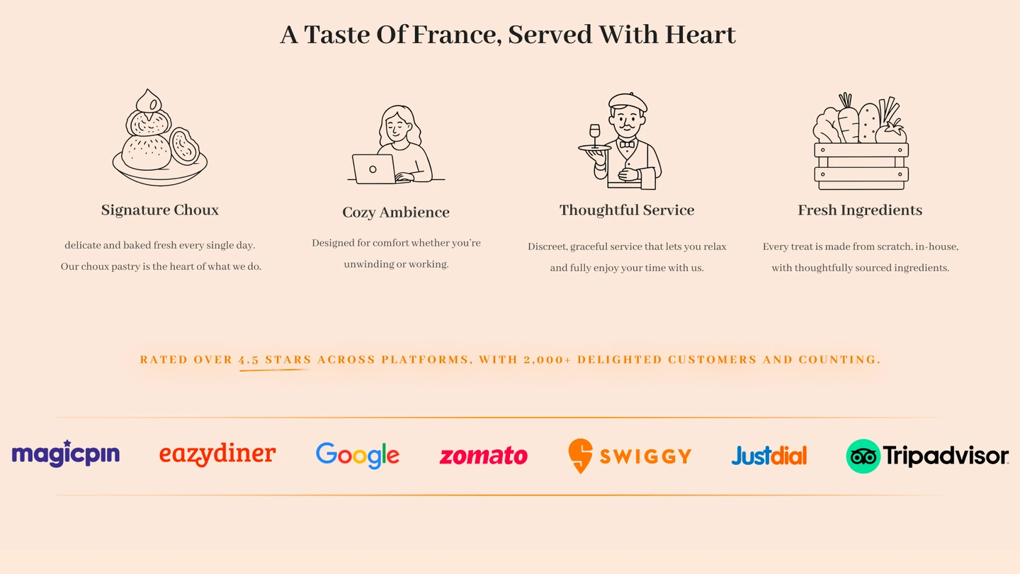
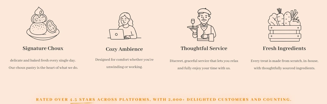
Warm peach and cream surfaces, brown serif typography and line illustrations carry the hospitality theme beyond the hero. Repeated illustration and heading treatments give the lighter studies a visual rhythm alongside the darker photographic opening.
Line illustrations, serif headings and peach surfaces establish the lighter direction.
Make the visit intention explicit.
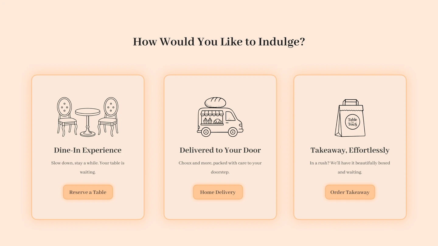
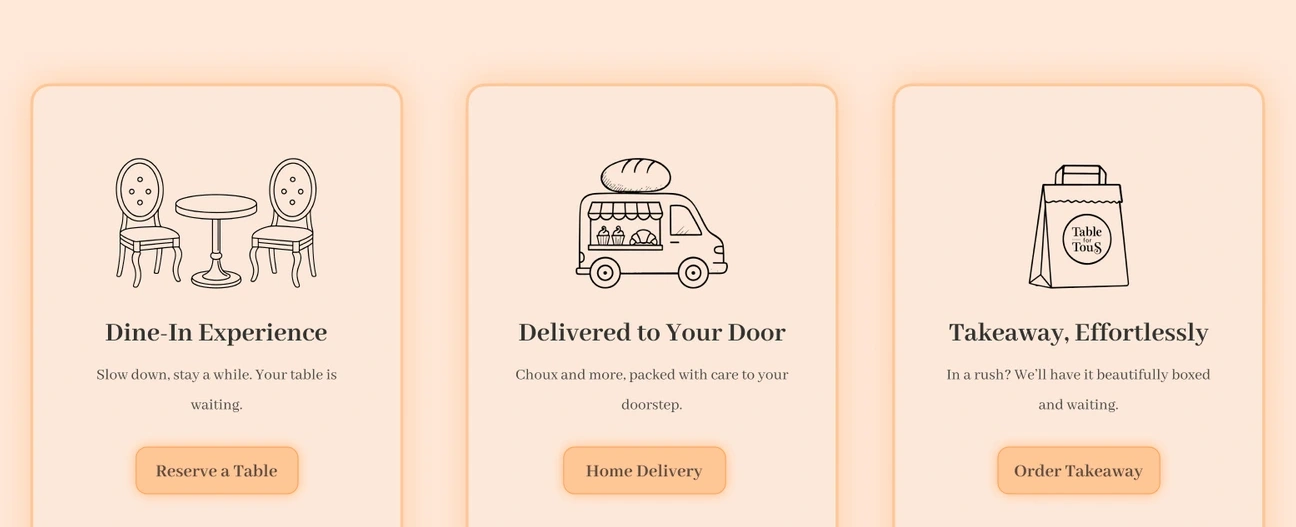
Separate cards distinguish dine-in, delivery and takeaway. That keeps the next action concrete within the broader introduction, while the business would need to approve the service copy and confirm live destinations.
Three ordering and visit intentions, presented as concept routes rather than connected transactions.
Photography for appetite. Illustration for character.
The pastry-led hero uses deep contrast and a bold serif headline. Lighter studies use peach surfaces, brown type and line illustrations to give supporting sections a warmer rhythm.
Serif character + quiet supporting text
Large serif headings lead the first impression; smaller supporting copy and repeated actions carry the practical information.
Colour roles: Espresso, Peach, Cream, Pastry.
Components in context
Visit-intention cards
Three repeated cards separate dine-in, delivery and takeaway in the ordering study.
Illustrated qualities
Line illustrations give supporting content a consistent visual voice.
Hero actions
Menu and reservation concepts sit beside the introduction rather than disappearing into navigation.
Examples are drawn from the independent desktop studies. Proposed service actions are illustrative.
A reservation is a different task from opening a menu.
The existing mobile gateway offers direct menu access. The desktop ordering study introduces a reservation action for dine-in. That changes the task, so any further development should first decide which route the visitor needs most.
Two directions for a desktop café presence.
I explored light and dark hero treatments, illustrated sections and ways to present visit intentions on desktop. The result is a set of independent visual studies showing different balances of food photography, typography and café character.
Reflection & next questions
The darker hero gives the headline a more consistent background than the lighter photographic alternative. A complete direction would still need to resolve menu access versus reservation intent, using the café’s actual service information.